Mumbai On The Go
Simplifying Travel In Mumbai
Mumbai On The Go is an iOS app that helps simplify public transport in Mumbai. My team and I worked on crafting and developing this app and shipping it on the iOS App Store.

The Problem
When it comes to public transport, Mumbai is very well connected and most people who travel within the city use all 4 forms of public transport on a daily basis. However, we found that many people, including us, struggled with issues such as searching for train timings, finding exact bus routes, calculating correct taxi fares etc. There needed to be a way to have access to this information at all times. We did some research on apps and websites that would help users get this information and found that there was no single app/website that provided this information. We new this would be great as a smartphone app as people have their phones with themselves at all times. So, we decided to bundle all of this information in an iOS app, making sure that it was robust and usable.
Since data connection was a problem in Mumbai at that time, we designed Mumbai On The Go to work without an internet connection. That meant the app worked on iPod touch devices as well. These were very popular in Mumbai when the app launched.
TYPE :
I worked on this project with my team as part of Angry Goo Dev. The app was designed and developed by us and published on the App Store.
METHODS USED :
Market Research, Wireframes, Prototypes, Development
MY ROLE :
I took lead in designing the train view of the app as well as redesigning and developing the entire app for iOS 7. I also worked on gathering the data used keep the fares updated within the app.
TIMELINE :
The app was designed and developed late 2011 and was redesigned in 2013 with the release of iOS 7.
Development Overview
We followed a very straightforward process right from design to testing. Since our app was created when iOS was still in version 5, our design was simple and used most of the stock UI elements Apple provided with Interface Builder. We created multiple versions of our prototypes testing different methods by which we could display the huge amount of information to the user. Below is the first basic version of the prototype that we created.
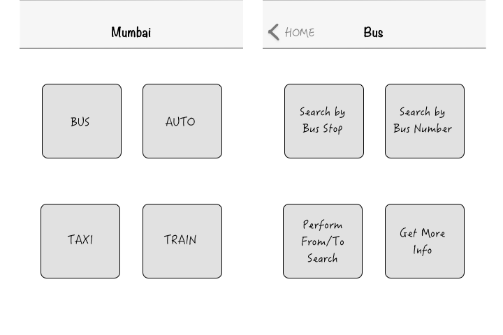
Wireframes
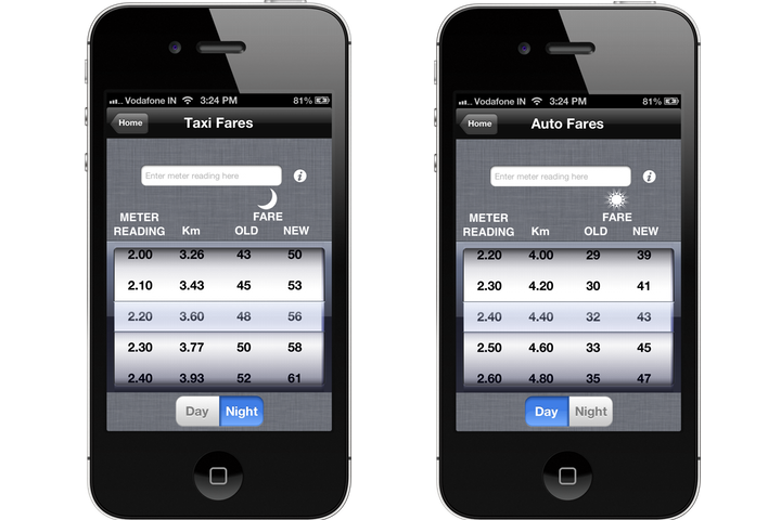
These are the main screens of the app ) with taxi and auto rickshaw reusing the same view to display fares. The home screen of the app presents the user 4 simple choices - bus, taxi, auto rickshaw and train. Each transport type has its own view as described in the screens below.
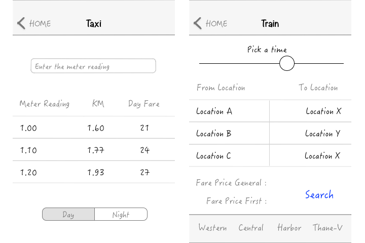
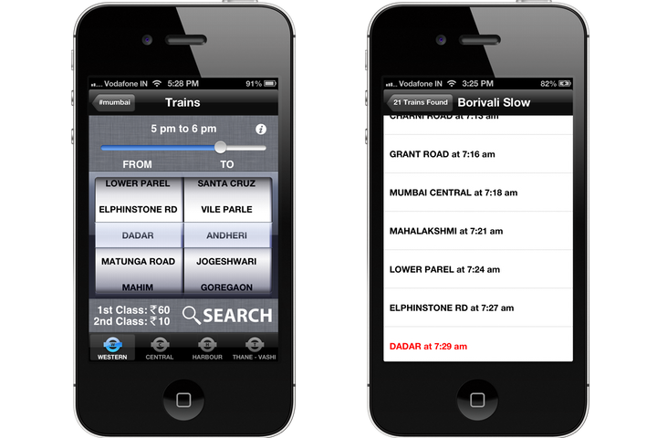
Our biggest challenge was designing the train view. In this view, we had to provide the user with options such as the time they want to take the train, the station they want to leave from, the station they want to go to, the train fare and the option to choose between all four train lines. After a lot of sketching and some discussions with potential users of the app, we came to the conclusion that this entire functionality should be designed within one view. The users specifically mentioned that they don't like going from one view to another while choosing stations. Below is the prototype we ended up with.
The train view was designed to automatically get the the current time from the user's device and move the slider to the correct position. We designed the FROM-TO station view as a split picker so that the user gets a better overview of what they chose as their FROM station. If we had put these in two different views, the user could forget what their initial choice.
We added train fares under the picker as it changes depending on the station that the user chooses. Then we made sure that the search button was on the bottom right as most users hold their phones in their right hand. We also made sure to think about reusing this view during the design and included a tab bar on this screen that would let users switch between train lines maintaining the same view and reducing the overall overhead on the phone's memory.
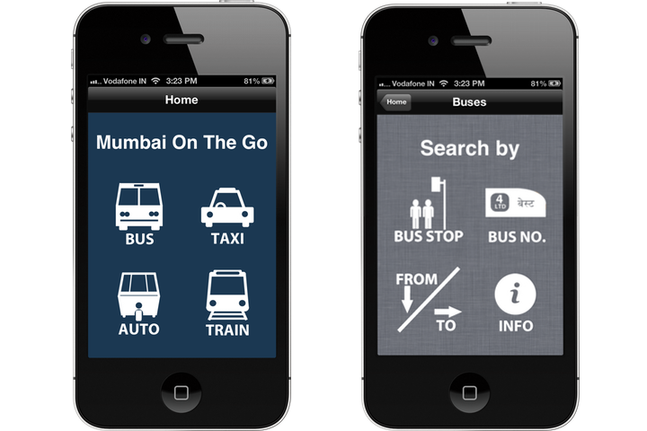
First Release
Our app received a positive response and our users gave us some useful feedback. Below are screenshots from our initial release.
First Big Update
The public transport system in Mumbai updated fares and timings very often and our users wanted a way to update this data without having to manually update the app through the App Store.
Since data (3G) was now more easily available in and around Mumbai, we decided to create a system that prompted the user within the app when an update was available. Only when an update was available would a button appear to update the app's data. We used a server to maintain the data and used a versioning system in code to ensure that the data on the user's phone was always up to date. The app would still work without internet and only needed a network connection to update data when the server was updated, which wasn't very often. Below is the screenshot of the home screen with new buttons added.
After our first big update, Apple released iOS 7. With a new design and new APIs in iOS 7, we decided to rebuild Mumbai On The Go so that it follows Apple's new Human Interface Guidelines. Since the app's previous UI was appreciated by our users, we didn't change it much. However, we did get several requests for adding AC bus timings to the bus section of the app.
iOS 7 Update
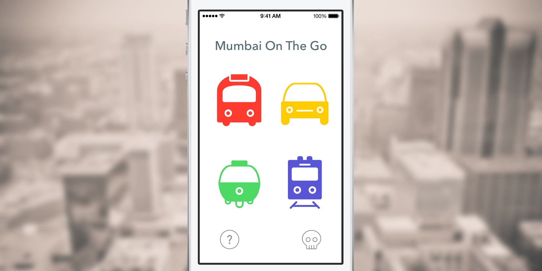
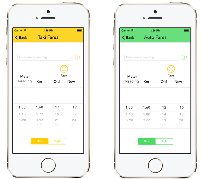
This update added the AC bus timings section that the users requested for and also included aesthetic changes throughout the app. Below are some screenshots of the iOS 7 update.
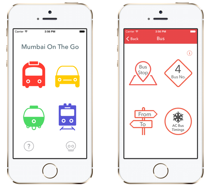
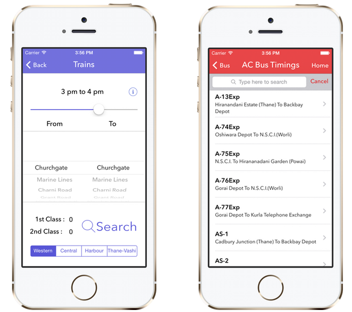
We removed the words BUS, TAXI, AUTO and TRAIN from the app as the users were now accustomed to the icons and had an idea of which icon was placed where. We kept the words in the bus view on the top right image because we added the AC bus timings and wanted to make the users aware of it (since all users don't read release notes).
We updated the colour scheme of the app to match the icons displayed on the home view. The status bar colour of the app was set to update automatically depending on the current view of the app. So depending on the colour scheme, dark or light, the status bar is set to the opposite colour.
We updated the train view and replaced the tab bar with a segmented control since the matching colour of the segmented control gave a better overall feel to the view.
Mumbai On The Go has users across the world and is being used by people everyday, improving their travel experience in Mumbai. The app has since been feature by Apple on the App Store and also been mentioned/reviewed on several other sites and magazines. Below are some reviews of the app.
“This is quite a handy app for details about bus,train,taxi and auto services in Mumbai. It also gives you train locations and timings. How very convenient.”
“One feature I did like a lot, and did not find on other travel information-based apps is train ticket fares and bus fares.”
“Mumbai On The Go is well worth the money.”