Hawaiian Airlines
Redesigning The Flight Search Experience
This is visual redesign concept of the flight search experience for the Hawaiian Airlines Mobile app. I redesigned the page for iOS staying true to the app content and the Hawaiian Airlines branding.
The Problem
I started by trying to identify problems in the current UI of the app. To do this, I first downloaded the app on my device and tested it. I noticed a few glaring issues but in order to confirm that I wasn’t the only one, I spoke to a few people who have used other such apps. I then quickly sketched out the UI and picked out what I found to be the most pressing UI issues.
TYPE :
Mobile app UI redesign completed in 6 hours
METHODS USED :
Research, Interviews, Visual Design
MY ROLE :
I worked on this project independently.
Research
Here are some of the issues I found after research and a quick heuristic evaluation.
- The number of travelers button - It was unclear which UI element you could use to choose the number of travelers; either the text box or the arrow buttons.
The start over button - This button was right at the bottom of the UI so a user wouldn't be able to start over until he/she reached the bottom. It’s possible that the user wouldn't even find that button and get frustrated.
Simple UI elements taking up excess space - UI elements such as the departure/arrival cities & dates that were taking up most of the space on the screen. I felt this could be improved by rearranging and increasing the spacing.
Early Designs
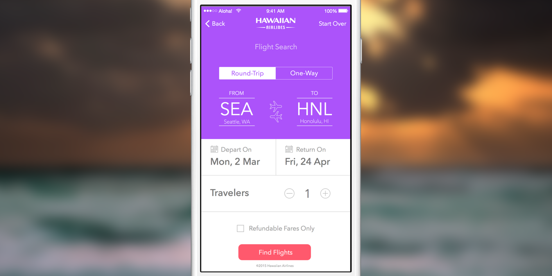
I created prototypes on paper as well as on Sketch to get an overview of how I can rearrange and improve the visual design. In the first prototype for iOS (shown in the image below), I moved the ‘start over’ button to the tab bar. I felt that it made more sense to have the start over button on top instead of making the user scroll all the way down. This also made the UI more aesthetically pleasing. I used a segmented control to show the trip-type and rearranged all UI elements so that they made more sense and fit on one screen.
I wanted to shift the UI elements so that order of all UI elements from top to down aligned with the process a user would follow while searching for a flight:
1. Choose trip type
2. Choose a departure/arrival city
3. Choose a departure/arrival date
4. Choose number of travelers
5. Find flights
In the next prototype (shown to the left), I added two airplane icons between the departure/arrival cities to show the current trip-type i.e. Round-Trip or One-Way. I added a calendar icon near the departure/arrival dates to indicate to the user that once they tap on that button a calendar will pop up. Apart from this, I added ‘+’ and ‘-‘ buttons around the number of travelers text. I did this to provide the user with a signifier indicating that tapping on these buttons will increase or decrease the number of travelers.
Final High Fidelity Design
Finally, I created the high fidelity screen and added it in an iPhone 6 placeholder. My intention was to stay true to the Hawaiian Airlines branding.